Green ink. Hue of choice for complainers and poison-pen writers, the famous ‘Disgusted of Tunbridge Wells’. Also senior officers, artists and headmasters. In the days before Excel, book-keepers often used it for the happy column of their ledgers, and the heads of MI6 have been signing their correspondence with it for over a century.
The psychologist and eugenicist Havelock Ellis (1859-1939) considered it a sign of sexual ‘inversion’, noting further that ‘green is very rarely the favourite colour of adults of the Anglo-Saxon race’.
As a lifelong fountain pen user (and alas, Havelock, as a Nordic-looking heterosexual), green ink has always been my favourite. It feels mischievous and inappropriate. It’s the ink of choice for the shameless plagiarist, L S Caton in Lucky Jim, or Albert Finney as Uncle Henry in Ridley Scott’s A Good Year, pickling himself in wine and reading Graham Greene in a moth-eaten panama.
For years I used Parker’s green Quink, and became quite used to having a splodge of it on the tip of my middle finger (my 1960s Parker 51 leaked for a long time until it finally went for a service at Battersea Pen Home and came back continent). And then suddenly I couldn’t get it any more. Turned out they’d discontinued it years earlier, and shops had been quietly burning through their stock until there was none left.
Since then, I have been trying to find a substitute, which is not as easy as you’d think. So many greens that look decent on a computer screen are too dark, too dull, or conversely too pale and insipid. The bluish hint in Quink is hard to come by, and for a while that was my white whale until I decided that a straight match was less important than a worthy successor. Absurd, certainly, but as with the little things, so with the large – and uncatchable fish syndrome has long been one of my defining traits (I love Big Fish, Albert Finney again…).
I blame the parents, since my family has form on this sort of nonsense. When Brooke Bond stopped producing Choicest Blend tea, my mother bought up as much stock as she could lay her hands on, then conducted literally years of taste tests until she found an acceptable replacement.
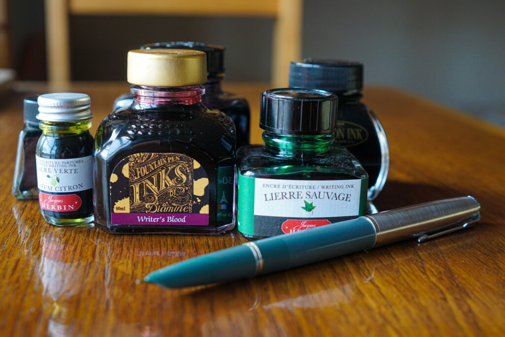
Anyway, I eventually found two I liked. Woodland Green from Diamine, and the wonderfully named Lierre Sauvage from Jacques Herbin.
But now an unexpected thing has happened. Cult Pens was doing a five-for-four deal on inks in October, and having stocked up on the greens (including an intriguing little 10ml pot of a lemon-scented one), I rashly added a red to my cart to make up the five – based mainly on the fact that the shade is called ‘Writer’s Blood’.
And lo, I love it. A deep, bloody brown red, a million miles from the angry traffic light red that used to spatter my homework at junior school (a colour forever associated with unthinking rule-adherence and pedantry). After all that effort, the greens have been relegated to the desk drawer for the time being. My diary entries and notes have turned russet for autumn – but you never know, perhaps they’ll go green again in the spring.
‘The ink is a mischievous thing, a small, fierce thing.’
– Helen Macdonald, H is for Hawk

Interestingly, years ago on a CPD course for teachers, we were told not to mark kid’s work in red pen (biro), as getting your work handed back covered in red ink, was very disheartening, but to use green instead. As one child said to me later, why was it supposed to be any better getting your work back covered in green ink? Green just became the new red…
Chrissie Crowther
A kid’s or kids’…♀️google predicty stuff or whatever it’s called…
Chrissie Crowther
That should be kids’ work, not kid’s ♀️
Chrissie Crowther
I think our teachers at school must have had the same diktat because a few of them switched to green around about the time I was doing my GCSEs. Only a few though – most were far too fond of the arterial red. I feel the same way when I’m editing reports for clients in Word. Even a fairly clean, well-written document looks terribly demoralising once it’s marked up with a few tracked changes, and I often have to begin my emails by saying, ‘Please don’t worry, this was good! This was good!’
indyjols